Chart Types
Dune supports the following chart types. You can mix multiple types in a single visualization — for example, combining bars and lines — as long as your base chart is not a pie chart. Expand each type below to see an example.Bar Charts
Bar Charts

Area Charts
Area Charts

Scatter Charts
Scatter Charts

Line Charts
Line Charts

Pie Charts
Pie Charts

Mixed Graphs
Mixed Graphs

Visualization Configuration Options
All chart types share a common set of configuration options. Use the tabs below to learn how to customize each aspect of your visualization.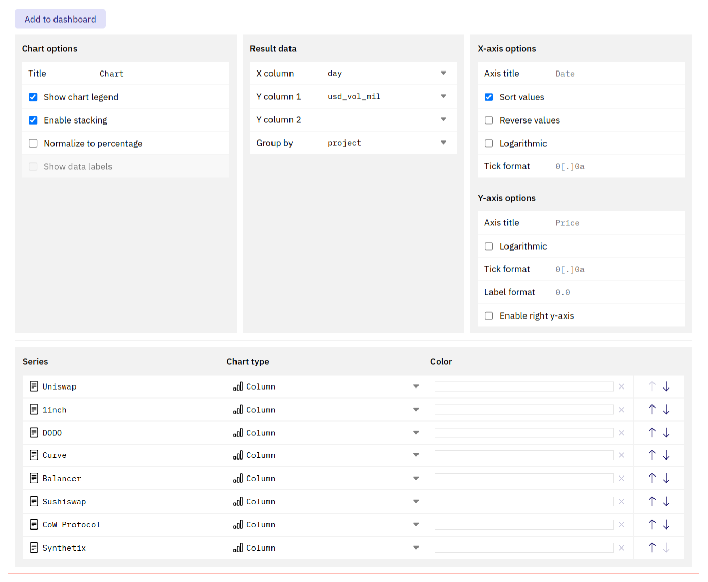
- Chart options
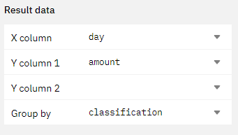
- Result data
- X-axis options
- Y-axis options
- Series options
- Pie options
This section allows you to define how to display your data.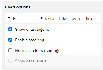
- The title will appear in all instances of this graph prominently at the top.
- The graph will always keep the name of the Query, even if you edit this.
- Ticking this box will enable or disable the legend for the chart.
- If applicable, ticking this box will stack the chart values on top of each other based on the x-axis values.
- If this is not turned on, the values will be plotted individually on the y-axis.
- The calculation underpinning this will always group the value corresponding to one value on the x-axis. Make sure your data is clean in able for this to work (avoid gaps in your data).
- This will normalize the chart to display percentage values of the chosen data table.
- The calculation underpinning this will always group the value corresponding to one value on the x-axis. Make sure your data is clean in able for this to work (avoid gaps in your data).
- Ticking this box leads to the display of the individual datapoints inside of the graph.
- This only makes sense in cases where you have few datapoints that are spread out far enough from each other to not overlap.
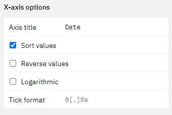
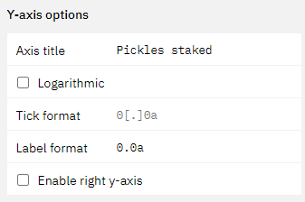

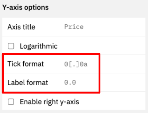
X/Y-axis Tick and Label formats